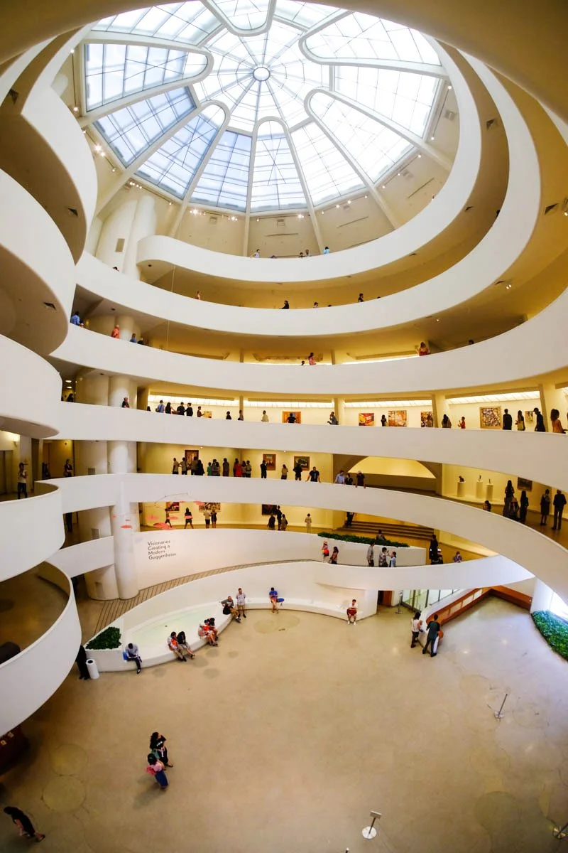
The Guggenheim Museum
“Architecture is the triumph of human imagination over materials, methods and men, to put man into possession of his own Earth.” - Frank Lloyd Wright
The Guggenheim Museum in New York , dedicated t o modern art was the first of the museums created by the Solomon R. Guggenheim Foundation and was founded in 1937. Often simply referred as ‘The Guggenheim’ it was first called the Museum of Non-objective Art to exhibit avant-garde art by early modernist artists such as Kadinsky and Mondrian.
The last major project of the architect Frank Lloyd Wright who designed and built the monument of modernism was one of the key buildings of the 20th Century. The cylindrical building, wider at the top than at the bottom, was conceived as a “temple of the spirit” and was opened to the public in 1959 making it his one of the longest project in working, given it started in 1943 along with being the most popular.
Guggenheim and Wright both passed away before the construction could be completed in 1959, though when Wright died in April 1959, the construction was practically finished, with only finishing left. Six months later, on the 21st of October, the museum opened its doors to the public.
Design And Concept
The museum broke a lot of centuries-old architecture rules. Its design stands a testimony that not all buildings need to have a floor system and it served as a shattering perspective for the squared lines of apartments it was set against. The exterior of the Guggenheim Museum is a stacked white cylinder of reinforced concrete spiraling upwards. The museum’s dramatic curves of the exterior, however, had an even more stunning effect on the interior.
The Guggenheim Museum provides a significant contrast with its surrounding buildings due to its spiral form, emphasised by the fusion between triangles, ovals, arches, circles and squares which lays in correspondence with the concept of organic architecture used by Frank Lloyd Wright in his designs.
The visit begins in the elevators and slowly leads the visitors on a journey where the art works are exhibited along a spiral, illuminated by a large overhead skylight, divided in the form a citrus fruit.
The structure is designed in such a way that via elevators one is taken to the highest part of the building, so that practically without realising one descends by a smooth helical ramp while one admires the works displayed on various interconnected levels, which are almost imperceptibly differentiated between one another by a small transition space.
While looking out toward the centre of the spiral, one can marvel at the stunning work as it reminds of a snail; allowing to have aperspective of the centre of the round and several levels exposed as the spiral ramp descends.
The route around the large void encourage reflection and lets the light play its charm for enjoyment of the art. The meaning of the art is communicated through the rhythms of this New York museum.
Structural Details
It took 7000 cubic feet of concrete and 700 tonnes of structural steel to create the shape of the iconic grid of the museum. Its sinuous forms were a great challenge for the contractors commissioned to develop the wood and metal formworks. After finishing some of the pieces and noting that the concrete would not flow through them naturally, they opted for the “gunite” (sprayed) concrete technique, whereby it is sprayed into the formwork rather than poured.
In total, they used three types of concrete for the different stages of the project: reinforced concrete lightened with “Lelite” for the main superstructure, lightweight reinforced concrete for the slabs and the ramp, and concrete mixed with gravel for the outer shell.
The Guggenheim’s floor slabs reach to meet lights up to 30 m between supports and, in some cases, have cantilevers of up to eight metres. Without going any further, the main ramp where the majority of the museum’s activity takes place is anchored to a perimeter beam of 30 cm and hangs 4.4 m into the interior space.
The central dome of Wright’s original design was wider and lighter, with a purely steel structure. However, the local authorities did not trust that such a structure would be able to support it and obliged the architect to reduce its diameter and incorporate reinforced concrete beams in its structure.
The white paint used for the interior walls ensures the works stand out, although the need to maintain such a light tone in a city as busy as Manhattan necessitates the exterior of the building being painted regularly. Between 2005 and 2008 they had to remove the eleven layers of paint that had already been added to the exterior façade in order to be able to repaint on a solid surface that guaranteed the adhesion of the new paint. The skylight was was manufactured from a steel and glass structure.
Important Features
» Impact-echo technology where sound waves are sent in to the concrete and the rebound of it is measured in order to locate voids in the structure.
» Spiral ramp which in which the diameter increases as it rises.
» Overlapping curves and complex intersections with long vertical of smooth planes.
Architect Frank Lloyd Wright
Date 1956-1959
Architectural Style Modern/Contemporary
Construction System Reinforced Concrete
Inspiration Inverted Ziggurat
Annual Visitors 3 Million
Reference
1. https://www.architecturaldigest.com/story/you-didnt-know-new-york-city-guggenheim-museum
2. https://www.archdaily.com/60392/ad-classics-solomon-r-guggenheim-museum-frank-lloyd-wright
3. https://en.wikiarquitectura.com/building/guggenheim-museum-in-new-york/
4. https://www.guggenheim.org/teaching-materials/the-architecture-of-the-solomon-r-guggenheim-museum
- By
Tuhina Chatterjee, Associate Editor, Civil Engineering and Construction Review


